After collecting a few links during my week end, I wanted to share with you some of the jewels I’ve seen during my random digital wanderings. Definitely, data visualization is on the rise.
Chef’s menu for today :
- Visualizing the top100 websites : convenient to know what people visit and where the traffic goes
- Mashable’s state of the twittersphere, on a graphic
- 33 data visualization about Internet, Social Media and their usage
- The social media effect in 1 graph
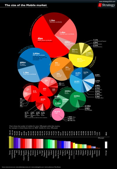
- The size of the mobile market
- The story of the evolution of email.
Visualizing the top100 websites : convenient to know what people visit and where the traffic goes
http://news.bbc.co.uk/2/hi/technology/8562801.stm
 PS : this map is from a fantastic series from the BBC about the power of the Internet. I do strongly encourage you to have a look at it :
http://www.bbc.co.uk/worldservice/specialreports/superpower.shtml
Mashable’s state of the twittersphere, on a graphic
You’ve maybe already seen this. If not, check this out (link hereunder)
http://cdn.mashable.com/wp-content/uploads/2010/03/1bntweets3.jpg
33 data visualization about Internet, Social Media and their usage
![]()
The social media effect in 1 graph
The size of the mobile market
Interesting to know in case of mobile related Social Media Campaign.
The story of the evolution of email.
To finish, the massive history of email – interesting to keep in mind for future mass email press release madness 🙂
 Source

