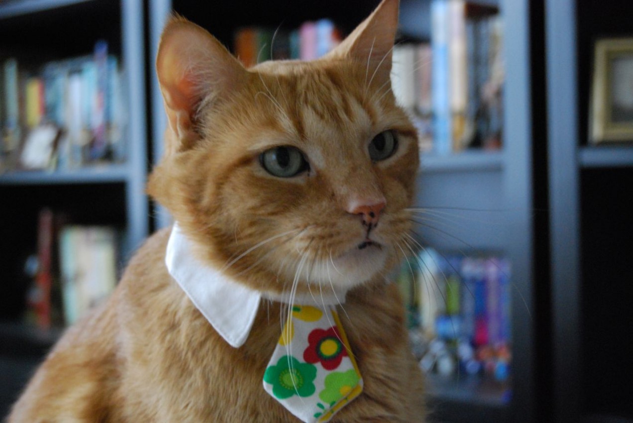
I don’t like to wear a tie. In fact, I actually hates it. I think it is a tool to project ego and social status, and absolutely symbolic and obsolete. Yet, I can wear a tie on some occasion to comply to the social norms. And it often cost me much. So I feel really disappointed/shocked when I see a bad PowerPoint or a sloppy presentation. I’m not talking about the speaker, but about the slides itself. How is it still possible in the 21st century to make bad looking PowerPoint while it doesn’t require much effort? In a presentation, it’s about 50% for the content, and 50% about the performance and how convincing you are. It’s not about being an “artist” or a “designer”, but applying basic rules to give your content the attention it deserves.
You wouldn’t show your sloppiness in how you’re dressed and how you’d behave. It’s the same with PowerPoint – why those inconsistent icons/colors/fonts choices, those bad picture ratios, those ridiculous alignments, those slides crammed with content without hierarchy or sense of contrast?
Top 4 easy fix to PowerPoint Faux-Pas
- Alignment – make sure your content is actually correctly aligned. Use the drawing guides for that, and use the alignment tools.
- Pictures – respect the picture ratio. Do never resize a picture without locking the ratio.
- Content – space is not your enemy: it’ll help to create contrast and hierarchy with your content
- Consistency – you can have bad color palette or choices. As long as it’s consistent across your presentation I can’t completely blame you
Want to make something actually pretty?
Easy. Just look at those resources and tutorials and you’ll be all set.
In fact, you should actually look at all Jesse Dee’s presentations. Period. Now, you don’t have any excuse.
Picture credit: ,,,^..^,,, (best flickr name ever)
